We have been experimenting with some of the acrylic grounds and pastes in the Golden Acrylics range. They offer a broad selection of products to create texture & other effects on almost any surface – in 2D or 3D. The possibilities are limitless….

PanPastel colors work well with many acrylic mediums, so I wanted to share images of some simple experiments showing how each medium affects the final result you can get when used with PanPastel.
CRACKLE PASTE
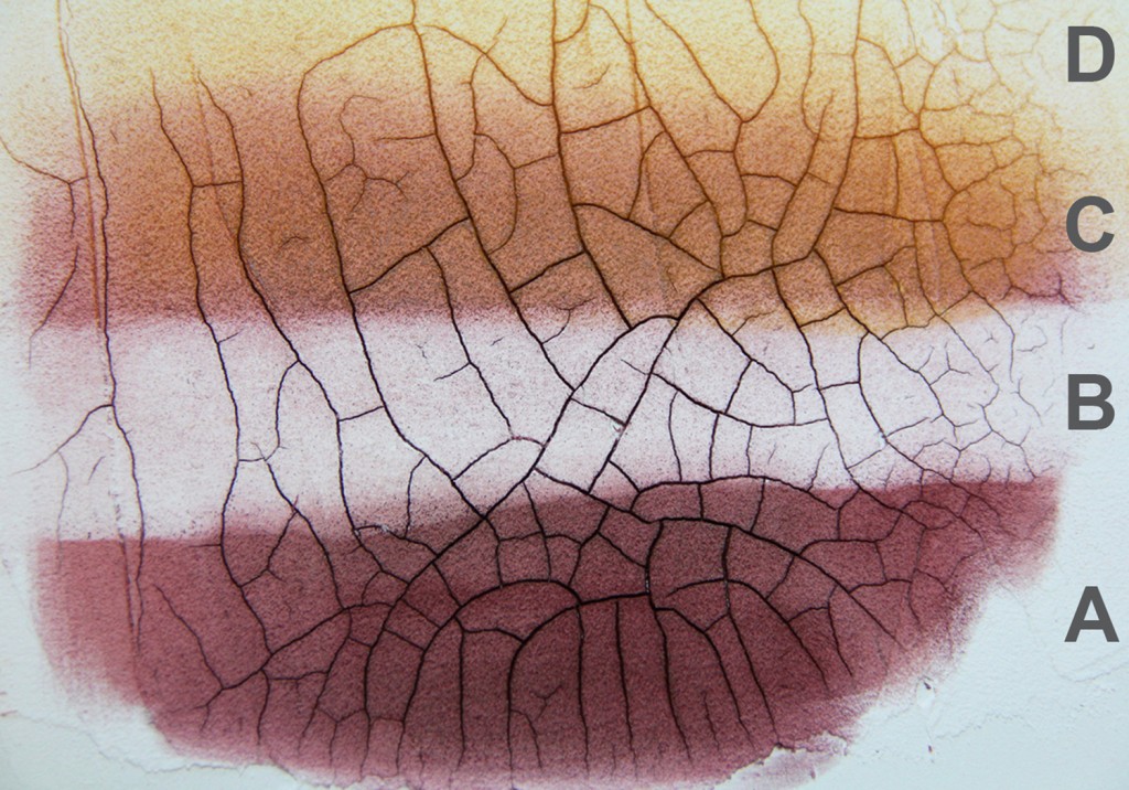
You can achieve interesting textures and patterns with Crackle Paste. It’s a thick, opaque material which develops deep cracks as it cures. Once the paste was fully dry and the cracks had formed (about 24 hours) I experimented by applying, blending, and removing PanPastel.
A – applied Permanent Red Extra Dark (340.1) with Sofft sponge, pushing the color into the cracks.
B – removed most of “surface” layer of red using a vinyl eraser, exposing just the color in the cracks.
C – applied Diarylide Yellow Shade (250.3) over the red, and blended lightly.
D – removed most of the red from the surface layer, leaving red in the cracks, then applied yellow to the surface for a two-tone effect.
MICACEOUS IRON OXIDE
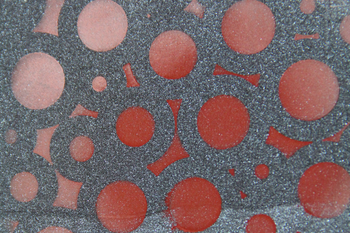
Micaceous Iron Oxide is a deep black color, and has a gritty surface when dry. The mica gives the surface a really beautiful sparkle. Whenever we show samples of our color on this ground we get a great reaction, unfortunately it is hard to capture the effect of this medium in a photo, so the images here don’t do it justice – just imagine a more intense version of what you are looking at.
The image above shows how the dark surface really shows up the intensity of the Violet (470.5) and Magenta (430.5).
This image shows Phthalo Green (620.5) and a little Phthalo Green Tint (620.8) blended on the surface. Then I erased the color using a vinyl eraser. The color erased easily, so you really can’t make a mistake….NOTE: as with most other surfaces if you don’t like the results you are getting then you can easily remove PanPastel with any eraser at any time, prior to fixing.
I used a template as an easy way to see how it looks when more of the black surface is exposed. Here I used Red Iron Oxide (380.5) and Red Iron Oxide Tint (380.8).
FIBER PASTE
Fiber Paste has the appearance of rough handmade paper when dry. I applied it with a palette knife to Bristol Paper (100lb / 260gsm). When it is dry it has an off-white color and is very absorbent.
Once the Fiber Paste was fully dry I applied Red Iron Oxide Shade (380.3) using a Sofft Angle Slice Flat sponge. Manipulating the Sofft sponge so that the color hit the “peaks” of the surface in some areas and was pushed into the lower parts of the surface in other areas. I then applied Yellow Ochre (270.5) over some of the red, allowing the colors to blend in some areas and by dabbing or bouncing the sponge over other areas leaving the yellow to hit those peaks without blending into the red. It created a really interesting effect.
ACRYLIC GROUND FOR PASTELS
Acrylic Ground for Pastels is an acrylic ground which can be used to prepare canvas and other supports for pastels. It gives the surface tooth, allowing more layers of pastel to be built up.
I applied a quick dry wash of Phthalo Greens (mass tone, shade & tint – 620.5, 620.3, 620.8) to tint the surface and create a gradated background. The colors blended nicely, the surface allowed me to achieve what I wanted so that the colors merged into one another seamlessly.
Then in the lower left corner I applied Phthalo Green Extra Dark (620.1) followed by a stroke of Phthalo Green Tint (620.8) to see if this surface would allow the colors to be applied without disturbing or blending into the layers of color underneath. The pastel ground’s tooth held the layers underneath perfectly – note: sometimes fixative can be used as a way to isolate the previous layers of color when using pastels on less toothy surfaces.
I used masking tape to mask off an area so I could create the blue/violet block. The masking tape hardly disturbed the layer underneath, and allowed me to create the lines quickly and easily. I blended Ultramarine Blue Tint (520.8) and Violet Tint (470.8) over the green background. The green stayed in place and allowed me to get the effect I was looking for.
As I expected the PanPastel color erased cleanly on this ground. (You can see some of the eraser “dust” left behind.)
I really enjoyed experimenting with these mediums. Are you using PanPastel in combination with acrylic products? If so, why not share images of your work at our Facebook page? https://www.facebook.com/PanPastelColors
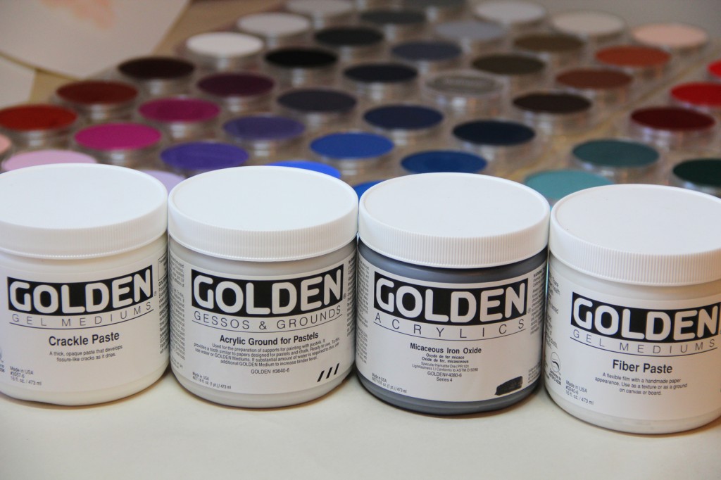
These are the products I used for these experiments. Many other manufacturers offer similar mediums in their acrylic ranges so check out the options available at your local art store.


