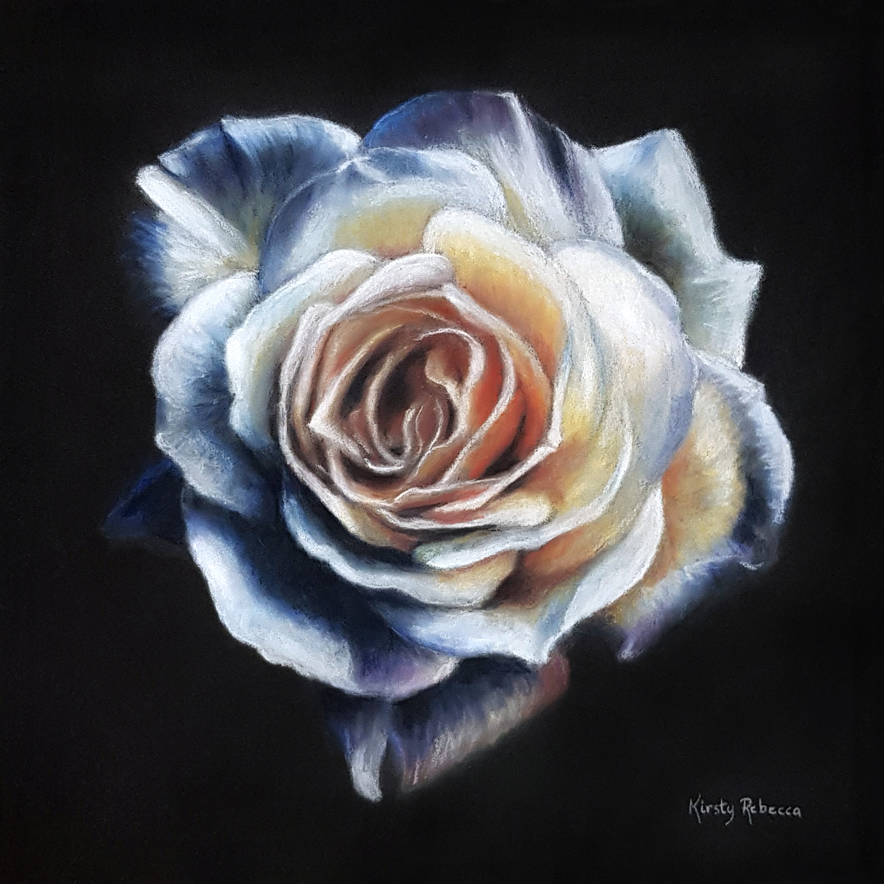
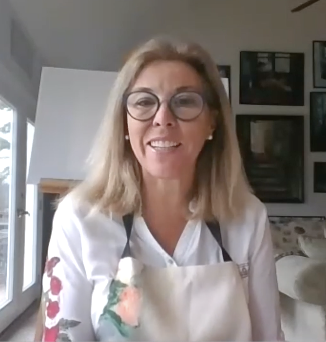
Focus on Surfaces: Sanded Papers

PanPastel is a very versatile medium in terms of its ability to be used on such a wide variety of surfaces from toothy papers to smooth and even delicate papers. So in the next few months we’re going to be posting about using PanPastel on several different surfaces.

Uart Overhead shot

We are starting with a range of sanded papers from UART. We have always enjoyed using UART paper with our colors. Our friends at UART sent us a full selection of papers to try for this post. And some for a giveaway too (more about that later!).

UART Studio

UART is available in a variety of grades – 7 grades in total – from 240-800 (the lower the number the larger the tooth (coarseness) of the surface). UART is beige in color as well as PH neutral and acid free. In addition to pastel colors it will also accept wet media. It is available in a variety of sizes, from 9×12″ to 27×40″ sheets, as well as rolls.

Back of Uart Papers

Grade no. is printed on the back of each UART sheet

The first thing I did was make one long continuous mark using PanPastel Phthalo Green with a Sofft Sponge Bar on a sheet of each grade. On the finer tooth papers – 800 & 600 (1st & 2nd from left) you can see the color stays uniform from the beginning of the mark to the end of the mark. (Click on any of the images below to see more detail with a larger size image).

240 (far right) is the coarsest of the papers as it has the largest tooth, so the color was “grabbed” more quickly by the paper as I made the mark, that’s why at the end of the mark the color began to thin out a little. Which means that on the coarser grades the sponge applicator needs to be re-loaded with color more frequently.

Uart papers

PanPastel Phthalo Green (620.5) on 7 grades of UART Sanded Papers  From Left to Right: 800 – 600 – 500 – 400 – 320 – 280 – 240

I also layered two colors. That worked beautifully. You can see the results below.

Uart Green & Purple Marks sml

Phthalo Green Shade (620.3) & Violet Shade (470.3) layered

PanPastel can be erased from almost any surface (prior to fixing) so I used a vinyl eraser to erase some color. Despite the holding power of the sandpaper, I was still able to erase the color cleanly, which means that changes or corrections can be made easily.

Uart erased sml

Erased PanPastel color (220.8 & 470.3) using a vinyl eraser

It was very easy to blend colors on the UART surfaces. I loved how the paper showed off how rich and saturated PanPastel Colors are.

UART RIOX Mix Sml

Red Iron Oxides (380.1/3/5/8)

I also compared the results of blocking in some color with a pastel stick and PanPastel.

Uart stick & PanPastel sml

Pastel stick color (left) – PanPastel color (right)

We often get asked whether Sofft Sponge Tools can be used on sand-paper. Sponge on sand-paper? The answer is yes. Of course over time there is some wear, and the thinner sponges like the knife covers will wear down more quickly. But the thicker sponges e.g. sponge bars and angle slice sponges held up nicely after quite a lot of use on all of the different grades of UART. (Tip: Avoid being heavy-handed when applying the color, there is no need to apply a lot of pressure as it doesn’t change the amount of color that will be applied, and helps to reduce any wear and tear on sanded papers.)

Uart sponges sml

Angle Slice and Sponge Bar after use on sanded papers

New to sanded papers? Many pastel artists like toothy surfaces as they can build up many layers of pastel color before filling the tooth. However for the first-time user sanded papers can be challenging to work with in the beginning, so it is a good idea to slowly move into sanded papers by starting with the finer/less toothy grades first until you get used to working with the “grab” of sanded surfaces, and then graduating to the toothier grades.

For more information about UART Papers visit: uartpastelpaper.com

Now for the giveaway – 5 lucky winners will receive a free UART Trial Pack (7 sheets), along with 3 PanPastel Colors of their choice! All you have to do is complete the giveaway form by midnight EST (New York time) Sunday June 2nd. Click “read more“ to access the form. 

UPDATE 6/3/16 – the winners have been randomly drawn. Congratulations to: Gerd Andersson (Sweden), Cora Pearl (USA), Martha Wagoner (USA), Candice Thomas (USA), Beryl (UK)

Continue reading

Artist Q&A: Lisa Rydin Erickson

We have been intrigued by the way Lisa Rydin Erickson is using PanPastel. She is using PanPastel with sumi ink on rice paper. We invited Lisa to tell us more about her work in this month’s Artist Q&A.

Lisa Erickson

Lisa Rydin Erickson

Tell us about your background as an artist.
I have very early memories of telling my mom before age 5 that I was going to be an artist; thinking artist meant being a “painter”. She had my picture taken with a special white angora beret she’d bought and that was enough – I was an artist. This is a strong and formidable memory. The fact that I wasn’t questioned but rather given the beret has always been an affirmation for me.

When did you become a full-time artist?
I am a full-time artist in that art does occupy my thoughts full time. In my adult life I draw and paint nearly everyday. As a child though, I didn’t always draw but instead I spent a lot of time outside in the woods or on my bike with vast landscapes in a small country town in Ohio.

Lisa Erickson

PanPastel & sumi ink on rice paper by Lisa Rydin Erickson

Were you formally trained or are you self taught?
I was formally trained at Kansas City Art Institute. I have a Bachelors of Fine Arts degree with a major in Painting and a minor in printmaking. Soon after college I spent a summer at Chautauqua painting with Deborah Rosenthal. I am interested in many different mediums and have found my way into educational experiences with mentors and instructors such as Jean M. Larson, Wang Ping, Roger Pulvers and Phyllis Weiner.

Describe your work.
My art is diverse. It is mostly 2D. Since college I have painted backdrops, murals, hand painted fabric for Kravet for commercial use; also, illustrated books, fine art painting, drawing in different mediums, photograph, bronze medallions, printmaking monotypes and most recently iPad drawings and animations. The medium really depends on what works for the project or what feels like the right look for the project or whatever calls to me at the time.

Lisa EricksonPanPastel & sumi ink on rice paper by Lisa Rydin Erickson

Describe the space where you normally create.
For the last several years I have worked on the dining room table in our home. It has proved to be the best environment for getting work done. I have two teenagers and can leave my “in process” work without worry. My daughter will often work on the other side of the table or sometimes my son will want to use the space for a project. It is nice to be in close proximity with them as well as to the kitchen and laundry so those kinds of things get a little attention as well. This arrangement is a testimony to my children that art is a lifestyle. Specifically, that art is a part of our lives. When working on larger projects I work on site.

Tell us about your creative process.
My creative process depends on the type of project I am involved with – for example, I have painted backdrops for a dance school for 11 years and I definetely had a strategy. The choreographer would list the songs that would be in the performance with some idea of what she wanted and I came up with a design gathered from many images and drew out a basic plan for the 50′ canvas. The images were for reference and detail. Usually I worked within a color range of 5-15 colors. I have used this technique for other projects like illustrating books (i.e. gathering images and making thumbnails). In other bodies of work the medium acts as the unifying element. It’s nice to explore subject matter and let the medium be the constant. Twyla Tharp wrote a great book about creativity called ‘The Creative Habit’. She talked about having something to start with for the next day. You can make a continuum bridge to the next day by planning the next step or a “to do” list, or starting with what you did the day before. I have worked on larger projects with a friend who has helped learn to make a checklist at the end of the workday of all the details needed to address the next step in the project. It helps you stay focused.

Lisa Erickson

Work in progress – PanPastel on rice paper – Lisa Rydin Erickson

When did you first being using PanPastel colors in your work?
My first experience using PanPastel Colors was to illustrate a book. I had carefully chosen about 5 colors to carry the color themed images throughout the books pages. I really didn’t know much about PanPastel except that Donna Downey was using and promoting them and I thought I would give them a try. It was at that time I learned PanPastel is a great way to add color to my drawings. I was recently gifted an entire set of PanPastel Colors and was both surprised and delighted as I experimented with the colors. It’s great to have all the colors and various sponges which help produce various textures and widths.

What surface(s) do you normally use?
I had been working on rice paper for about a year and love the texture of the PanPastel on it. The pigment grabs the unevenness of the thin paper and acts like a watercolor without wrinkling the paper so terrible. It is a nice contrast of dark ink and soft wash of pastels. The pastels respond to the paper in a delicate way.

Lisa Erickson

PanPastel & sumi ink on rice paper by Lisa Rydin Erickson

Are you doing things creatively with PanPastel that you weren’t doing before?
Yes, they add color to the line work that I make with my sumi like drawings. The color adds both interest and dimension to the work. I can’t really think of another medium yet that can translate the same way the pastels and sponges are able to emit. They have much more varied width than colored pencils, are softer in texture and variation than markers and lay on top of paper and blend easier than paint.

Do you have any tips / techniques to share with other artists that are using PanPastel?
Layer your drawings between extra sheets of rice paper. I use a pad of sumi paper rather than a roll of paper. The roll of course has a tendency to either crease or roll up and smear the delicate pastels. I think that the less that you handle the paper the safer your drawings will be. I have sprayed a heavier paper with spray adhesive and laid down a sheet of rice paper so that you can have a sturdier surface which makes it easier to photograph and frame and won’t wrinkle. It is also traditional to work on a felt pad which works great blotting ink and has a little give as you draw. It is still a mystery to me how sumi painted panels and wall hangings are created. There is a lot more investigation into mounting rice paper that can still happen on my part. Rice paper though is a beautiful surface. Lucky for me sumi ink, rice paper and PanPastel Colors work well together.

Who and what are your creative inspirations?
I like art. I like looking at art. I like the colors and candor of Camilla Engman, structure and compositions of Diego Rivera, Minnesota artists like Jennifer Davis and Landland, James Waryge and Kimberly Christensen of Elva Pottery in Saint Paul. There is a lot of good silk screen art right now. Early on I really liked Chagall, Matisse, Kandinsky, Russian Constructivist posters, Bauhaus, Sonia Delauney and Giotto. I will always love Braques, East Indian miniatures and Etruscan encaustics, beautiful sumi painting (unfortunately I don’t know specific names) and Japanese etegami. I like the ease of what Flora Bowley is doing and mariaurora’s fabric collages and I love German artist Beerlala’s new paintings. Mary Livoni makes beautiful dreamlike charcoal drawings of Chicago. I love anything that Nicola Moss makes, medallions and prints. I like Ashley Goldberg and Mulysa Melso. I better stop……

What excites you most about your life as an artist?
All the elements that make up 2D work, line, composition, proportion. I love making, looking at and thinking about art. I like having that visual language to view the world.

What’s the most valuable lesson you have learnt on your journey as an artist?
I think is is a combination of advice from two people. First, I was standing at the New French with Kevin Kling and he told me a story about a man that he met down by the sea. It is really a distinct memory so it must have been an embellished story. In my memory it was night down by the sea in a different country and the waves were washing up on the sand and the moon was out, there is a rocky cliff to the left and just this old man and Kevin standing there. The old man told Kevin “make something every day, it doesn’t matter what you make just make something every day” and then Kevin told me that he believed the guy and that’s what he tried to do. The other story is from a friend that I admire and has just started painting. She said that she was easy on herself and just enjoyed painting for the day and didn’t bash the poor little painting. She just painted another one the next day and enjoyed the process. I think that is really great advice. The best thing I express to my kids is the thought of life as a river and to just jump in and it will carry you.

Lisa Erickson

PanPastel & sumi ink on rice paper by Lisa Rydin Erickson

What are your artistic, and other goals, for the future?
I think it always goes back to painting. Painting is my compass. As I move through different projects, I re-center and ask myself what do I really want to do and assess what makes me the most fulfilled, I usually think of painting. I think the word ‘painting’ goes back to the word that was in my head when I was so young. To me that meant “hurry up mom and get me to Sunday school where there were two easels and you could stand in front of one of them and ‘paint’”. My goal is to keep ‘painting’ keep making art. Whatever medium that will keep the inspiration open. PanPastel has been a great way to keep that inspiration alive. It’s immediate and vibrant. I have another story that I will be working on in the next year. Again I will use the rice paper sumi ink and PanPastel combination for the illustrations. It’s a good fit to create numerous images that have a storybook feel. Again I can use the pastels to delicately add color and texture to fill in the sumi drawn figures.

When you are not working on your artwork what other interests do you have?
I like camping, walking, reading, gardening and spending time with my family. I am married and have two kids and also work as a dental hygienist.

Are there any current projects that you are working on?
Recently I created 17 animations on my iPad for a short movie that was presented at the “Nature Heals” event for the University of Minnesota Landscape Arboretum. My daughter (age 13) and I are working on some large paintings that will be used at the Saint Paul Flint Hills Childrens’ Festival in early summer 2013 and later in the summer I will have a couple of art shows one of which is at Clear Lake Art Center in Iowa.

Strong in the rain

Lisa’s book “Strong in the Rain” can be viewed at http://www.blurb.com/books/3034250-strong-in-the-rain

To see more of Lisa’s work visit her website lisarydinerickson.com and blog apapersnowflake.blogspot.com

Artist Q&A: Krista Svalbonas

image-3

I recently met Krista Svalbonas at a conference in New York City. Krista uses PanPastel in many of her installations. She is using the colors in a unique and exciting way – in combination with encaustics – where the color extends beyond the panels onto the wall itself. I wanted to find out more about her work and process so I invited her to take part in our artist Q&A series.  Continue reading

Tip: Changing Colors in Palette Trays

Tray & lid photo

Here’s a handy tip: we always keep a PanPastel lid handy to remove colors from the palette trays or to place the colors in the palette. As the tray cavity holds the colors securely, threading a lid on the pan of color makes it easier to grip it, and helps prevent your fingers from touching the other color surfaces.

So although the palette tray’s cover does the job of covering the colors once you have finished painting, try to keep at least one lid available for an easy way to remove and replace the colors in the palettes. (Each PanPastel set comes with at least one lid, and of course the individual colors are sold with a lid.) More info on the palette trays can be found here (including an intro. video): http://www.panpastel.com/

Joanne Barby

We discovered Joanne Barby’s work with PanPastel when she posted an image of one of her portraits on our Facebook page. We had such a great reaction to that image that I asked Joanne to share some more images of her work so that we could post them here.

Owl email-3

Joanne is based in Australia and works in a variety of media including colored pencil, charcoal, ink, acrylics, watercolor and of course plenty of PanPastel! Her recent work focuses mainly on animal and people portraits. The pieces shown here are approx. 80% PanPastel. Continue reading

FOCUS: Acrylic Mediums

We have been experimenting with some of the acrylic grounds and pastes in the Golden Acrylics range. They offer a broad selection of products to create texture & other effects on almost any surface – in 2D or 3D. The possibilities are limitless….

PanPastel colors work well with many acrylic mediums, so I wanted to share images of some simple experiments showing how each medium affects the final result you can get when used with PanPastel.

Continue reading

Dawn Emerson

We were delighted to feature Dawn Emerson’s artwork on our new Sketch & Tone kit packaging. We are huge fans of Dawn’s work, and while we haven’t had an opportunity (yet) to attend one of her workshops, we have heard they are powerful. Dawn’s work is full of positive energy, and apparently that’s how she teaches. Inspiring and encouraging her students to push the limits of their own creativity. Dawn has been using PanPastel in her mixed media paintings for some time. So this short interview about her work and her use of PanPastel is long overdue. Enjoy.

    “Howling at the Moon” by Dawn Emerson (mixed media with PanPastel)

Thoughts on PanPastel…

During recent email correspondence with Len Jagoda, a wonderful equine painter based in Georgia, we were discussing his use of PanPastel. Unsolicited, it prompted Len to put together his thoughts on how and why he uses PanPastel in many of his paintings. This is what he wrote:

“PanPastel Colors are ideal for landscapes and impressionist pastel paintings; however, that is not what I do. I do portrait work, mostly dogs and horses and in fact in a rather “tight” realistic style. One might then ask, why am I such a believer in PanPastel and how do I use them?

First the “how”. I have used PanPastel Colors in underpainting, glazing, for special effects on the background and for background landscape (most likely a more common application).  I apply them with the tools that go with the medium; but I also often “push them around” to create hard edges and/or transitions by using Color Shapers. It is amazing how one can drag a  Color Shaper through an area of PanPastel and create a fine whisker on a dog’s muzzle.

image003

“Mr Jeffy” by Len Jagoda - Pastel on Stonehenge Paper  12 x 20″

Continue reading

Artist Q&A: Mindy Lighthipe

Mindy Lighthipe is a botanical artist based in Florida. She uses PanPastel in combination with watercolor and other media. Her drawings and paintings are in many private, public and corporate collections, including the Florida Museum of Natural History, the Denver Museum of Natural History, and the New York Botanical Garden Gallery in the Bronx. In 2009, she was awarded a silver medal at the London Orchid Show at the Royal Horticultural Society. Mindy wrote and illustrated “Mother Monarch”, a children’s book about the butterfly life cycle.

“Mother Monarch”  PanPastel & Watercolor

Continue reading

Lisa Pressman

At the recent CAA conference in New York city, I met Lisa Pressman, a New Jersey based painter.

Lisa was demonstrating on a neighboring booth – R & F Handmade Paints.  I took these photos of Lisa experimenting with PanPastel Colors, instantly creating some interesting results.

One of her first “on-the-spot” experiments, shown below, involved using a template over clear encaustic medium on Encausticbord. She applied PanPastel Red Iron Oxide with a Sofft Knife over the template to create a pattern on the surface. Then fused the color into the encaustic medium with a heat gun. A simple yet effective technique!

Lisa using a Sofft Knife to apply PanPastel to encaustic medium, over a template

Continue reading

New! Photo Artistry Workshops

Dianne Poinski has launched an exciting new website: Photo Artistry Workshop

Subscribers to the website will have access, during 2011, to her video lessons. She will share her hand-coloring techniques with subscribers and will also provide tutorials on various aspects of photography including working with Photoshop, filters, textures, and papers for digital printing, along with many other hints and tips.

Dianne hand-colors her black and white photographs using PanPastel Colors & Sofft Tools. If you are a mixed media artist, photographer, or anyone interested in exploring new creative horizons with digital photography and hand-coloring, Photo Artistry Workshop is worth checking out.

The following video shows some of Dianne’s artwork.

http://www.youtube.com/watch?v=Nugtk_Z34ic

Patricia Baldwin Seggebruch

I am an encaustic painter. I have been painting abstractly in this melted beeswax medium for over seven years now; preceded by abstract mixed media.

“Gears”

Last year I paid a visit to Toronto Canada at the prompting of a student. In her store/studio she had PanPastel Colors. Their delicious packaging hooked me first, followed quickly by the delight of using them first on paper then on my encaustic paintings.

I use PanPastel in many different ways with my encaustic painting. The most deliberate use of them is to ‘blush’ or ‘tint’ the wax as I apply layers of medium (beeswax with damar resin) and color (pigmented medium). This blushing offers a new look to the coloring of the wax in that it is more diffuse and transparent; offering for more layering and depth development than is possible with just the pigmented wax colors.

Using PanPastel to blush/tint the wax for “Ansley”

I also love to use stencils and mask off areas, build the wax with these different resists, then tint the different depths of wax created in this method of application with the PanPastel.

Tinting textured and masked off areas using the Sofft sponges

Continue reading

Pastelmat Giveaway

We are often asked by artists using PanPastel for the first time, what papers they should use. This is a difficult question for us to answer as PanPastel works on almost any surface, from low tooth surfaces such as vellum and ink-jet / digital (matt) papers to the very toothy pastel surfaces. So it really depends on the artist’s preference, and the results they are trying to achieve.

On our website we feature a page called “Substrates” that shows a PanPastel mark on a variety of different surfaces – those are just a few of the potential surfaces that can be used; also our gallery shows various surfaces that artists are using in combination with PanPastel Colors.

One of the pastel surfaces that we really like is Pastelmat from  Clairefontaine in France. What do we like about it? Well, it is a premium card surface (360gsm/170lb) that has a unique coating of cellulose fibers, giving it excellent “grab” so it can hold many layers of PanPastel and pastel stick color, however at the same time its surface feels deceptively velvety and therefore it’s not abrasive. The best of both worlds for pastelists! Not only is Pastelmat popular for all types of dry media (pastel, colored pencil etc) you can also use it with wet media such as gouache, acrylics, watercolors etc.

The following video is a landscape painting demonstration by Deborah Secor. In this video Deborah takes you through the process of painting a full landscape from start to finish using only PanPastel colors & Pastelmat.

Here is a list of the colors used in this demo: Materials used

On Deborah’s Gouache painting blog she has also posted a step-by-step gouache painting demo on Pastelmat: gouache.blogspot.com

Deborah Secor writes regularly for The Pastel Journal, and her work has been featured in several books including “Pure Color: The Best of Pastel” and “Painting With Pastels” by Maggie Price.

Continue reading

Artist Interview: Leonard Jagoda

Leonard Jagoda lives in Georgia. His paintings can be found in private collections from Washington State & Texas to Saudi Arabia. His work hangs in some of the most prestigious stud farms in Kentucky.

He has received several prestigious awards for his work, and has been included in many juried shows, including the American Academy of Equine Art’s 2009 Fall International Open Exhibition. His portrait of Big Brown was juried into the 2010 International Exhibit of Animals in Art at LSU. Recently, he has been selected to create the official artwork for the 2011 Aiken Steeplechase. Since 2008, Leonard has been using PanPastel Colors in his paintings.

“Big Brown Formal Portrait”  16 x 14″

Note: For the paintings shown Leonard used PanPastel Colors, pastel sticks & pastel pencils. He paints on a variety of surfaces including Stonehenge paper & Canson Mi-Teintes. Click on any image to see it in more detail in a larger format.

Continue reading

The Pastel Journal – Sydney McGinley

I have been travelling quite a lot recently, so I haven’t had time to write here; however today I managed to write a little and catch up with the contents of my mailbox (well most of it!).

I was delighted to receive the latest copy of The Pastel Journal. Always a great read! I was particularly looking forward to this issue as I knew that our friend, master pastelist Sydney McGinley, was going to be featured in an article about portrait and figurative painters. Her painting “Footbath No.1″ is also featured on the front cover.

Sydney’s work is featured in “Portraits from the heart” in the Pastel Journal.

Sydney lives near us in Pennsylvania and was one of the first artists to begin using PanPastel. And she uses them beautifully, in combination with pastel sticks & a Conté pencil on Wallis sanded paper.

I love her use of color! I know that mark-making is very important to her, and in the Pastel Journal article she talks about how she also likes to include drawing as a strong element within her paintings. She has told me in the past that she likes that PanPastel can also be applied in semi-transparent layers, allowing the pencil marks to show through if she desires.

More of Sydney’s paintings can be found at the PanPastel webgallery page and at her website: SydneyMcGinley.com

I’ll be writing more about Sydney soon, as she has kindly agreed to do an interview for PaintDrawBlend.com

Mixed Media Experiments

For a few years we’ve known and worked with Scottish artist Celia Buchanan. Celia is based in Florida, and has been working & teaching in the art supplies industry for a number of years.

“Orbs”  - gold leaf, PanPastel, encaustic

Recently, Celia has been experimenting with different mixed media techniques for her demos & workshops; incorporating a number of the products that she represents in her role as an independent sales representative. She’s been combining PanPastel with a number of materials including: oil pastels, antique beeswax, Jacquard’s Piñata color, Jacquard encaustic wax, along with layers of decorative papers & gold leaf.  She recently sent these images showing the results of her first experiments. Pretty cool!

“Orbs 2″ –  PanPastel, Piñata color, encaustic, with leaf skeleton

Celia told me about a number of Jacquard product demos she’ll be doing in the next few weeks, during which she’ll be including PanPastel techniques, similar to those shown above; including at the Sam Flax store in San Francisco on Wed August, 25th (1-4pm) and at the Art Supply Warehouse store in Orange County, CA on Sat Aug 28th (10-1pm).

To find out more about other dates on Celia’s demo & workshop schedule visit: http://www.jacquardproducts.com/events.php

Artist Interview: Dianne Poinski

Dianne Poinski is a professional photographer who hand-colors her black and white photographs with PanPastel with beautiful results. Dianne lives and works in Sacramento, California.

“Roses” by Dianne Poinski

Tell us about your background as an artist.
When I was younger, I loved to sew, do crafts and play my guitar. My brother was the “artist” in the family, so I didn’t even think that I was doing “art” during that time.

My interest in photography began when my children were young and I wanted to learn how to take better pictures of them. At the same time I was in school trying to finish up and get my business degree in accounting so I could become a CPA. Taking a photography course helped satisfy the art requirement, but I was not prepared for the passion I would feel for that medium. I never finished school…. and never became a CPA.

I have taken a few classes here and there, but for the most part I am self taught.

I became a full time artist around 1995. I started out taking pictures of my friend’s kids and hand-coloring them. Then friends of friends started asking me to do the same for them. Those were my first paying jobs. Eventually I stopped taking portraits and began showing my other work at art festivals and my studio.

In 2008 I incorporated teaching hand-coloring workshops as part of my business.

Describe your artwork.
I take photographs of flowers, landscapes and architecture, print them as black and white prints and then hand-color them with PanPastels.

“Illuminated”  by Dianne Poinski

Continue reading