

Julia Woning New Book
July 6, 2019


New Animal Art Kit
September 10, 2019Our latest Artist Q&A is with Julian Farrar, a British artist based in Sweden. We have been following Julian on Instagram for quite a while, and absolutely love how he uses PanPastel for his drawings. So we were delighted when he agreed to tell us about himself and his work.
Tell us about your background as an artist.
Art has always been something I have been attracted to naturally. It has never required effort to be enthusiastic about drawing. I always had a desire to get better at it no matter what people around me said about the work I was creating. At school it was the only thing I was interested in. Having said all that, I have always had an issue with how art has been taught to me. At every stage of my art education I have resisted being told how to create MY art by someone else. This started at school and continued into art college on my BA degree.
It seems I do not take advice about how to make my images my way. This is one of the main reasons I became an art teacher myself as I wanted to create an environment in my classroom where students could find their own way of expressing themselves rather than merely finding ways of pleasing me or getting an A grade. I find my role as an art teacher inspires me in my work as an artist and I often use my own art when teaching my students.

Describe your artwork.
My art has evolved over the years
but a few things have remained constant. I love creating images that have
narrative. I find it fascinating to discover ways of using textures, lighting, objects
to tell a story with each element contributing to the whole. I am not sure if
this translates into the final pieces but it is an important part of the
process for me as I work.
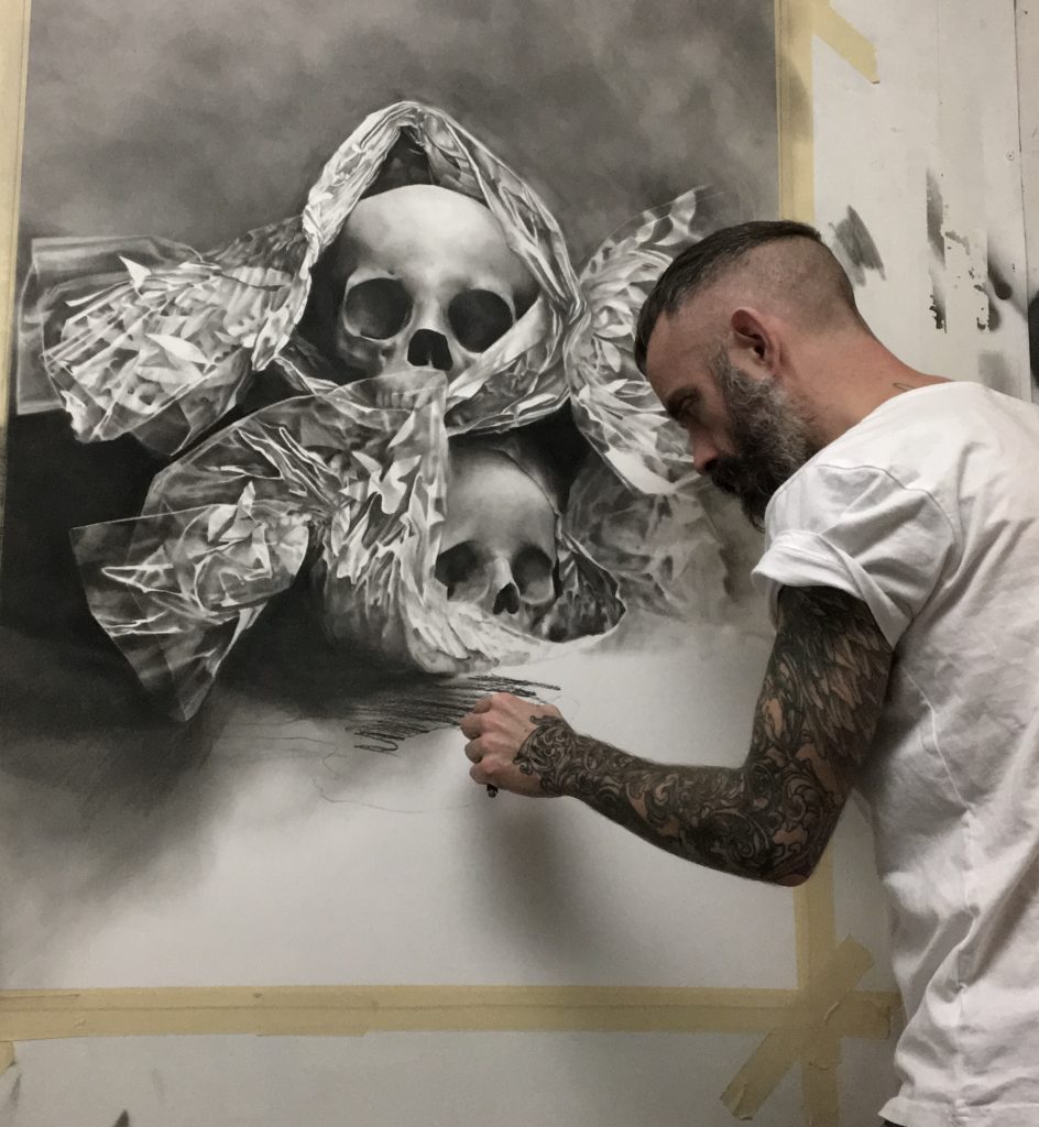
My images are always representational but I strive to incorporate expressive marks and gestures to contrast the highly representational areas. I am not interested in hyper realism where all marks are removed to create a ‘photographic’ drawing. For me that is missing an important aspect of why I draw. I find endless fascination in how light and dark relate to each other. How the tones morph from dark to light tells its own story. Does the texture on the surface of an object hint at calmness or violence? Do the dark shadows jump quickly and violently to highlights or do they gently develop through the grey tones? These are things I think about when designing a piece and in the hours/days/weeks it takes me to draw it. A composition will never be successful or interesting if it does not utilize all the tones and contrasts. I suppose it is like trying to make music without all the notes…..

Tell us about your creative process and the materials that you use.
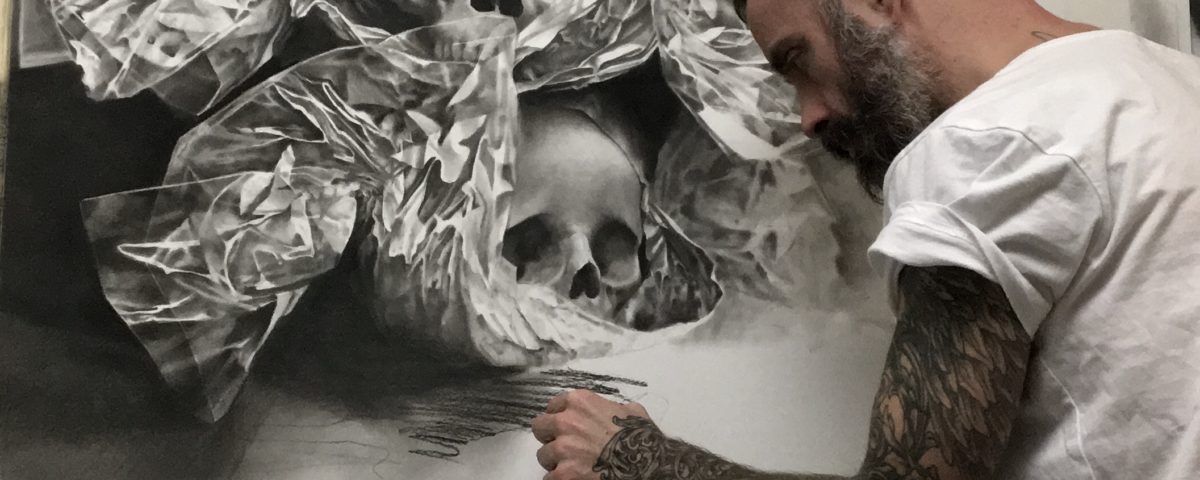
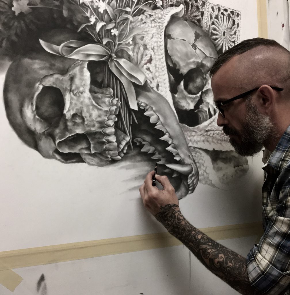
My current series of drawings are inspired by Fairy Tales. Each still life drawing attempts to illustrate the characters and the events within the tale. The common and central element of all the scenes is the human skull. I enjoy drawing the human skull as it is challenging both pictorially and emotionally. It also embodies the violence that is ever present in these stories.
It often takes me more time to design these compositions than to draw them. For weeks/months the ideas run through my brain in various forms and combinations. I am looking for that feeling of excitement at the prospect of drawing the objects together. I take photographs of the objects I feel could be used to represent a character or an event. It might be something mentioned in the text or something I associate with it. I ‘sketch’ the objects together using an iPad Pro in order to work out a composition that would work in telling the story. This process often reveals new and more powerful compositions than the one i has in mind at the start. I recognize this process is complete when the still life contains elements that will be fun and challenging to draw technically but also are interesting and thought provoking as they relate to the story and characters. It must have both elements before I start putting pencil to paper.

When drawing I like to work large in scale. Each drawing is over 1 meter high. I find this size works well for these drawings as it gives me enough space to work in high detail but also allows for expressive marks especially in the background shadows. As I tell my students, each drawing should begin fast and loose and get slower and more controlled as you work. I start by getting the main shapes of the objects in first. I resist the temptation to dive into the textures and details at this stage even though they are often the reason I am doing the drawing in the first place.
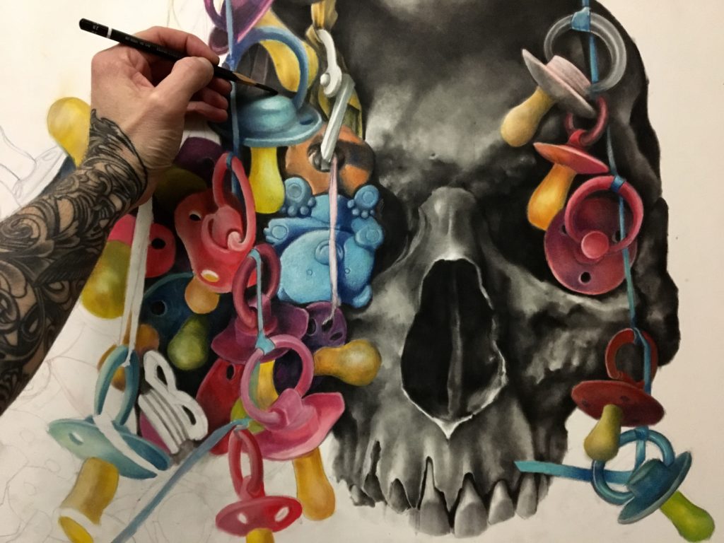
Throughout the drawing process I use a combination of techniques and materials. I love the fast and expressive marks I can get from PanPastel and a sponge. It is the perfect way to inject energy and movement into a drawing in the early stages. As the drawings develop the marks slow down and I try to achieve surface textures and lighting effects that contribute to the overall narrative of the scene. Colour plays an important role here. In the past I have not used colour often in my drawings. But in this series it is vital. I do not use many different colours in each scene. I can achieve all the tones and nuances required using a variety of layers and pressure when applying the PanPastel.
How did you discover PanPastel & when did you first begin using PanPastel?
I do not remember how I first discovered PanPastel. I think it was whilst looking at another artists work but I cannot remember who. I do remember the first time I used it though. It was like being able to paint whilst still be able to use all my knowledge and understanding of drawing techniques. Wonderful.
How do you use PanPastel colors in your work – what is your technique/process for using
them?
PanPastel allows me to make nearly any mark I wish in my drawings. I can create large expressive marks at the start of the drawing or I can create intricate textures and patterns in the final stages of a piece. It is so versatile when used in combination with sponges and erasers. In my work I rely on the grey tones mostly. I only use black at the end of a drawing to increase contrast and drama in certain areas.
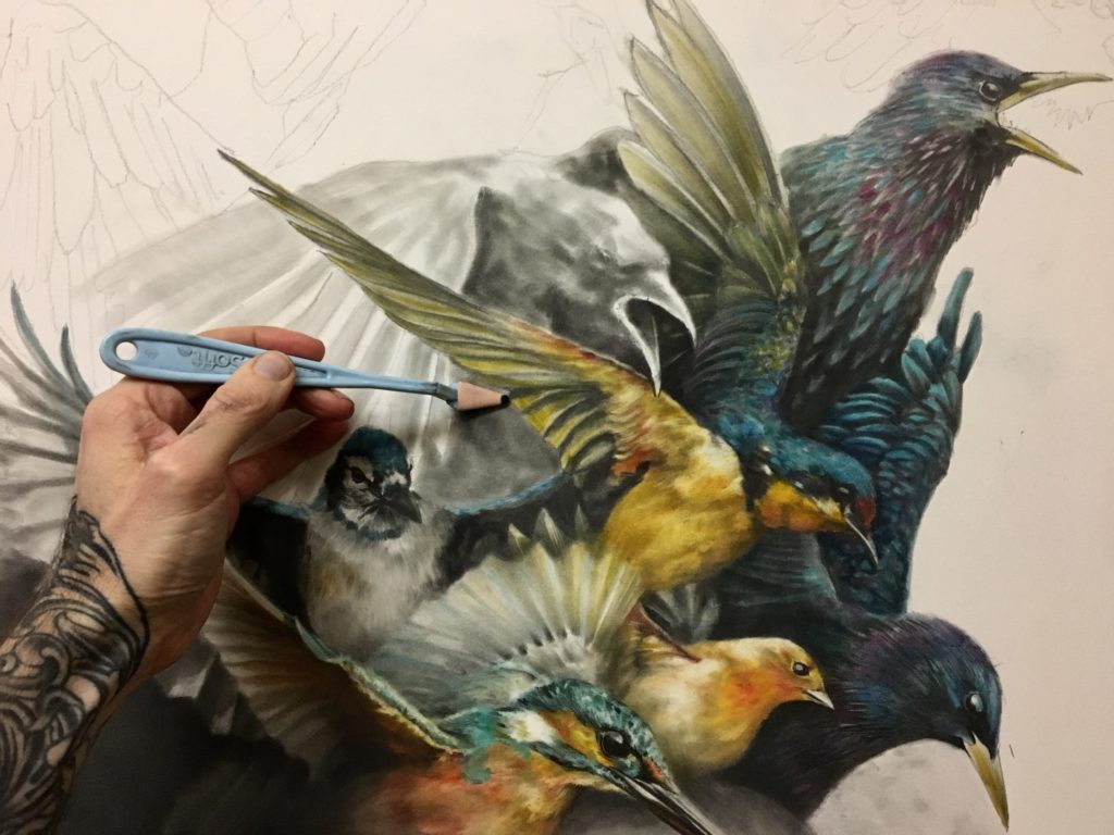
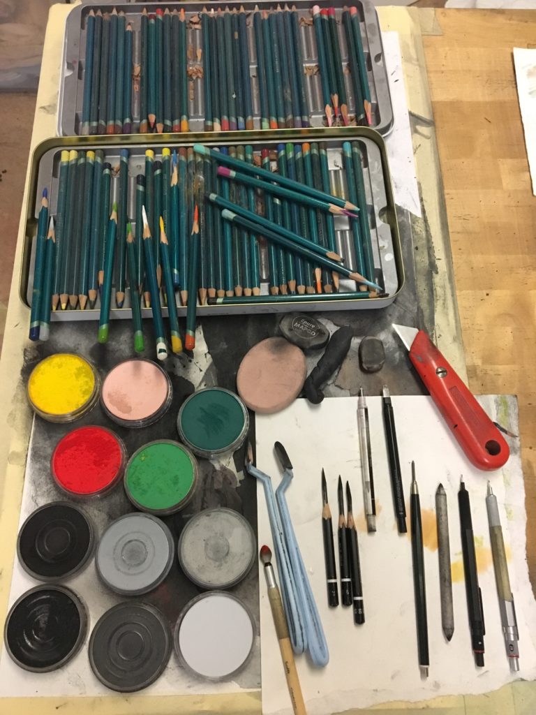
I also use a variety of pencils in my drawings as they compliment the marks created with PanPastel. Mechanical pencils allow small, focused marks and tighten up the soft appearance in some areas. I employ a variety of erasers too when drawing as I can draw just as many textures with them as I can with any pencil. I have soft erasers that can be molded to any shape or small precise erasers for the high detail areas.

Are you combining PanPastel with other media – if so, which media – and how do you use them together?
Whilst PanPastel is the main material I use in my drawings it is not the only one. I find pencils are a good addition to the marks created with PanPastel. They add a focus to the marks when trying to describe fine textures or areas of high contrast. When working with colour I often use layers of Panpastel to build up the tones and forms and then work into these areas with colored pencils or lead pencils if the tones need dampening down.
The main material I use in combination with PanPastel are erasers. In fact most of the marks made in my larger drawings are created using a variety of erasers. I work with soft, moldable erasers for larger and less defined marks and fine exact erasers for the fine details in the final layer of a drawing. The process of building up tones and textures and then working back into them to create the perfect balance is exciting and infinitely challenging to me. PanPastel works well with erasers as it does not bond to the paper too much before fixing. It can be worked back to near white whilst maintaining traces of the tone or colour.
What surface(s) do you normally use with PanPastel?
All of my drawings are done on paper. I have found the perfect weight for my style and techniques is 200 gsm. It gives me just enough texture in the surface to be able to build up good depth in the shadows using layers of greys and blacks and in the highlights I can achieve a fine level of finish and accuracy.
What do you see as the main benefits of using PanPastel in your work?
I have always favored drawing over painting to express my ideas but have felt I am limiting my marks and expressions through not embracing paint in the same way as drawing. With PanPastel I feel I have the best of both worlds. I can use it like paint to achieve large expressive marks whilst maintaining the control and familiarity of dry drawing materials that I have spent decades perfecting. I also have found it be a highly adaptive material. It can change depending on my mood or the drawing I am working on at the time. This is something I appreciate as I am constantly looking for ways of expanding my drawing and mark making capabilities.
Are you doing things creatively with PanPastel that you were not doing before?
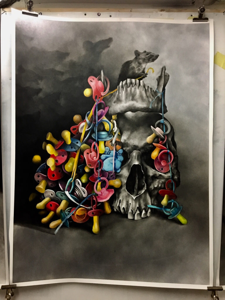
In this current series of drawings I am combining colour into my usually monochrome world. I am using the colour to highlight aspects of the still life that tell part of the story. The red aspects of Red Riding Hood for example. They are subtle but are important to the violence of the story. These colour aspects often contrast their black and grey surroundings, the colourful birds on top the back and grey skull of Cinderella and the colourful children’s dummies of the Pied Piper are an example of this.
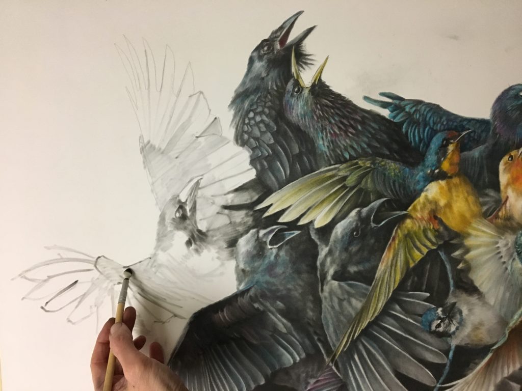

I am using PanPastel to achieve the balance between colour and monochrome in ways I have not done before. I have always resisted colour in my drawings as it has never sat well with my preferred black and grey drawing. By combining the grey tones and the colour tones of PanPastel I can find tones that sit well together.
I am also using PanPastel in combination with masking fluid to achieve new and unpredictable marks. I work on a drawing until it is completed and then work with masking fluid to mask off areas I enjoy thereby creating a drawing within a drawing. I then use thick black charcoal to delete the remaining areas outside the masking fluid. Once revealed, these selected areas take on a new life separate from how they were originally perceived.

Do you have any tips/techniques to share with other artists who are using PanPastel?
I have found through years of working with PanPastel that it is best to not think of it as another drawing tool. It can be so much more. With it you can do so much more than just replicate what you see in front of you. It can be used to express ideas whilst capturing textures and lighting effects of a scene. You can add energy, violence and excitement to your drawings by combining it with erasers, charcoal and traditional pencil marks. You can make colour vibrant and powerful in a piece or make it a subtle element that adds warmth or menace. Every drawing should start off fast and loose. This is my most important piece of advice to my students in my classroom. PanPastel makes these starting marks really fun and exciting.

What’s the most valuable lesson you have learnt on your journey as an artist?
I have never really cared about how others see my art. It has always been mine to do and mine to criticize. It has made me very difficult to teach I am sure but I am ok with that. My most valuable lesson is to not care what others say about your art. Have a select few whose opinion you value and then ignore the rest.
What are your artistic (and other) goals for the future?
I try to not have any goals or timescales in my work as an artist. All other aspects of my life have these and so I resist applying them to my art as well. I find I do better art when I do not think about future shows or commissions. They get in the way and take away the fun of making the art I like.
When you are not working on your artwork, what other interests do you have?
I enjoy running when I am not in the studio. It gives me time to think and plan my drawings. It is a good time to think. I am also a full time teacher of art. I love this work and find it inspires me in my own art. Being around teenagers all day is wonderful and adds so much energy to my life. I also have 3 kids of my own who keep me busy and keep me smiling constantly. Some of my most precious memories in my studio are when they are in there too working with me or just talking to me as I draw.
JULIAN FARRAR
Julian Farrar – British artist living in Sweden. Full time teacher. Full time artist. Full time dad and husband.


Website: julianfarrar.com
Instagram: drawswhat1likes

